Suddenly your newsletter's visual voice matters more than you think...
What happens when you finally invest in a new look
Here's something I've learned over six years of running my copywriting business: your visual brand isn't just about looking pretty – it's about building trust. When readers see your newsletter in their crowded inbox, you want them to think, "Ah, it's you!" before they even read a word.
Nobody Does It Alone
Because I love the power of collaboration, let's talk about working with designers. I've tried all different things—from budget-friendly Upwork projects to DIY attempts in Canva (where I learned just enough to be dangerous).
But my favorites have always come from collaborating with creative friends who get my vibe and what I'm trying to do. There's something special about working with people whose work you admire and who you genuinely want to grab coffee with.
Take my website logo. Christine Herrin created it at my dining room table in San Francisco; people always comment on it. (Yes, I always wanted a kitchen table origin story!) That logo has lasted ten years because it came from a place of genuine connection and understanding. (Christine used her own handwriting instead of a font!)
The Right Time, The Right Designer
After my interview with Christina Loff about making welcome pages more vibrant (if you haven't seen that talk, check out this post), I knew it was time to let someone else do it for me. My Canva-made logo was feeling tired, my welcome page needed work, and I could not stomach one more late night trying to get that damn watermark to be bigger.
I'd been following ’s work at Unstack Substack, and honestly? I wanted to collaborate with her on future client projects. So I did what writers do – I reached out.
Building Blocks of a Visual Voice
I've always thought of design assets, whether for your website, emails, or social media, as your visual voice. It's your brand identity and voice.
People you want to work with and your readers should connect with it by using colors, images, and fonts to make them feel something. In my case, I'm going for simple, smart, cheerful, mixed with fun and a bit of a pop.
Let me break down what I brought to the table:
➡️ My ride-or-die yellow – been using it for six-plus years
➡️ Gray and black as supporting players
➡️ The handwriting font (Kristi used Disruptors Script to match the handwriting in my website logo)
➡️ My current website design. I wanted a more playful, creative feeling that also felt tied to my website design.
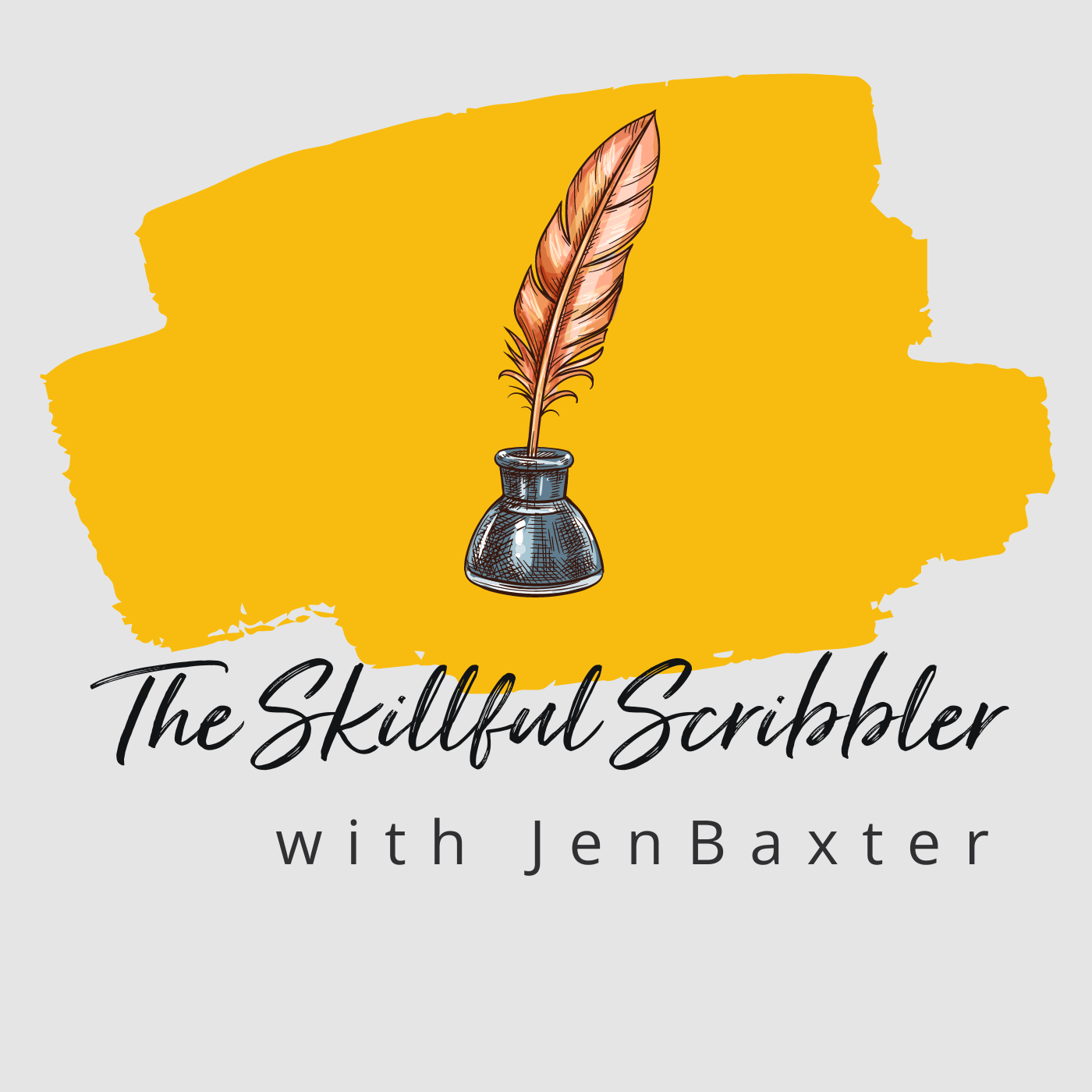
Here's my amateur Canva attempt at a logo that had the basics in place and lasted for two years here on Substack.
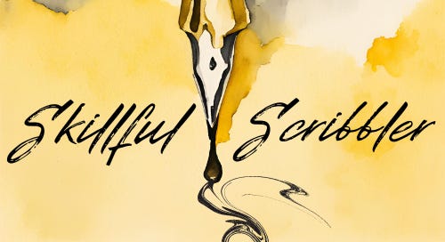
And here’s how Kristi cranked up my style:
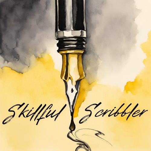
1. A Logo That Feels Like Home
Night and day difference from my Canva creation. I love the black and yellow with the water color feel. And the best part? Kristi set it up in my Canva account, so I can use it without having to send an SOS email every time I need to resize something.
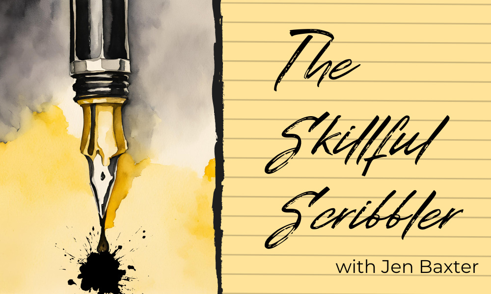
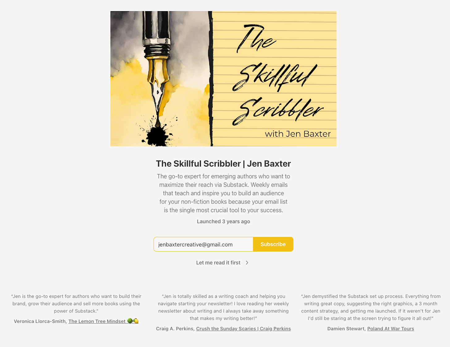
2. A Welcome Page that Says “HELLO!”
Your welcome page is where potential subscribers on the Substack platform land; often, it’s your first impression. It’s also a big piece of real estate for your visual voice, so you want to take advantage of it. Your image should have equal weight to your Newsletter Northstar (or bio), which tells readers what to expect.
I love the ink splotch and the lined paper. It feels fun with a bit of pop.
And if you’re not on Substack and just seeing this in an email, here’s what a welcome page looks like.
3. Stylish Email Headers, Two Ways
One has a lined paper for the newsletter, and the other has no lined paper that I’ll use for LinkedIn and other platforms. Simple, but smart. Writers appreciate good paper, even when it's digital.
4. A Wordmark that Works
So, the wordmark is a quirky Substack space at the top of a publication. (If you only get this in email, you’ll never know it exists.) But if you have a Substack, you’ve likely wondered how people get that lovely branded image at the top. I can tell you—with A LOT of fiddling and trial and error to get it the right size. But it adds an extra pop when you do.
5. Small Things Matter
You know those decorative lines that break up text? They're not just pretty – they give your eyes a rest between sections. Kristi made some to feel like they belong in a writer's newsletter. (She even made the Halloween-themed one below, which you can ask about in the Thursday subscriber chat if you're interested.)
Have a Blast and Feel Inspired
Here's the thing about branding that most people don’t know: it needs to last. I'm talking five years minimum. (After a glass of wine, I might even say ten years.) This isn't about chasing trends – it's about creating something that feels right for your writing journey.
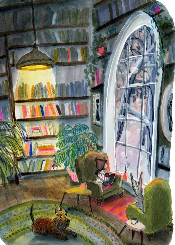
I love brainstorming images. I pulled images from Instagram and Pinterest that had nothing to do with newsletter or website branding. Bedding, dishes with a texture or pattern, and scenery shots are a favorite of mine because they have such a strong feeling. Often, those images point me toward the vibe I want readers to feel.
I sent Kristi this Substack, A Bottle Full of Rain, by illustrator Anna Wilson, because I love the feel of her work.
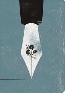
And this image of a fountain pen I found on Pinterest:
It’s usually a great way to show a designer my visual voice—because this is about expressing a vibe that feels true to my writing and readers.
Romance writers get this instinctively. They know their covers need to signal something specific to their readers, book after book. Newsletters work the same way. Your visual elements aren't just decoration – they're silent signals to your readers that they're in the right place.
Your Visual Voice Checklist
If you're considering a visual refresh for your newsletter, here's what I've learned:
✔️Work with someone whose portfolio makes you think "yes, that"
✔️Keep what works (like my attachment to that specific yellow)
✔️Think about how it'll feel to people discovering you for the first time
✔️Remember that professional design is an investment in reader trust
Join Thursday's subscriber chat to geek out about design details, or comment below to tell me how you feel about your newsletter's look these days.
P.S. There’s a little over a week until the election, so please get out and vote! I’ll take a newsletter break next Monday because I know we’ll all be oversaturated with things to read and the news — hang in there!


